


Interaction Design
Interaction design is how a council website feels to use. It covers the decisions that determine whether a resident can navigate to the right service, understand what they need to do, complete a task without confusion, and trust that the website represents the authority they are dealing with.For LocalGov Drupal projects this means applying your council's identity to the platform's components and templates — consistently, accessibly, and in a way that will hold up across the full range of content your team will publish after go-live.
What this covers
Digital identity We evaluate your existing brand guidelines and adapt them for digital — accessible typography, responsive sizing, colour usage that meets contrast requirements, favicon and logo usage. Where a council does not have digital identity documentation we produce it as part of this process.
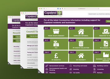
Site-wide elements The elements that appear on every page: header, navigation, footer, cookie bar, search, and the expandable services menu. These are designed at mobile and desktop sizes as interactive Figma prototypes, giving your team an exact high-fidelity representation of the finished pages before a line of code is written.
Components and styles The building blocks your content editors use day to day: typography, lists, alerts, tables, download links, image and video handling, block quotes, and contact detail formats. We also design richer builder components used in microsites and campaign pages — accordions, callout boxes, featured teasers, tabs, and navigation tiles.
Page templates Applying the digital identity to LocalGov Drupal's content types: service landing pages, service sub-landing pages, standard content pages, guide templates with pagination, news listing and article pages, subsite templates, search results, and the homepage. Delivered as interactive Figma prototypes at mobile and desktop sizes.
Accessibility All design work is produced to WCAG 2.1 AA standards. Accessibility is not a final check — it is a design constraint applied throughout. Colour contrast, focus states, touch target sizes, and screen reader behaviour are considered at component level.
Figma handover
We work in Figma and produce files that include a developer handover mode for direct transfer to front-end developers. The complete Figma prototyping kit can be retained by the council for future use — for updating designs, onboarding new suppliers, or maintaining consistency as the site evolves.


Want to see how this works in practice?
We're happy to walk you through examples from previous council projects and talk through how we'd approach yours.